Bloom Branding
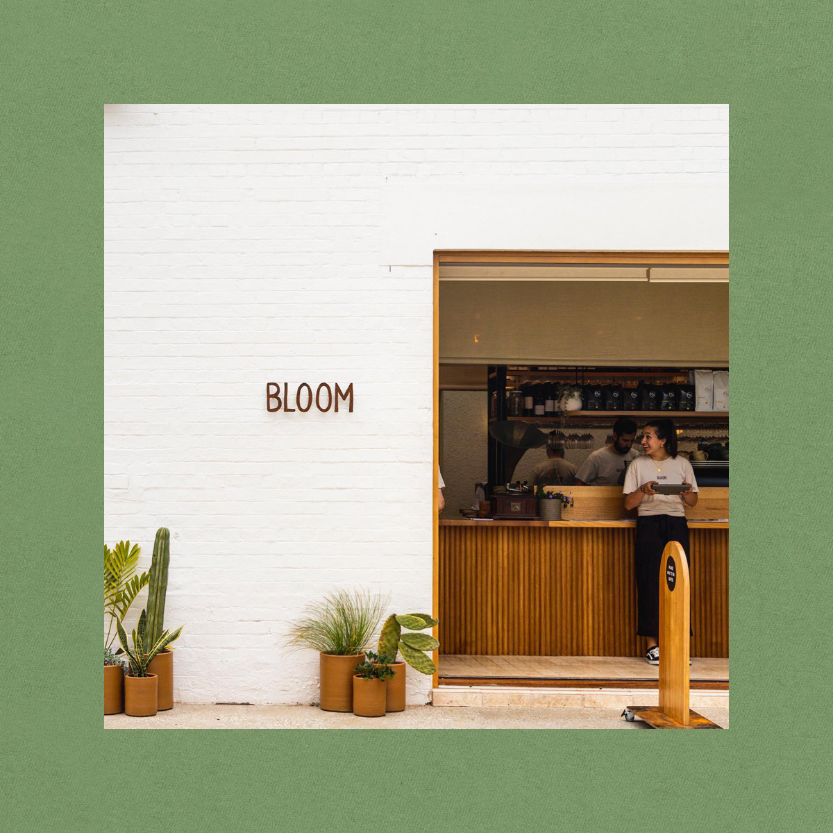
Bloom, once an old tram barn, has been beautifully converted to a light-filled cafe and function space, surrounded by heritage buildings and towering gum trees, all bordered by a river who's waters once fed the giant fermenting vats of malt and barley for their famous brewery neighbours.
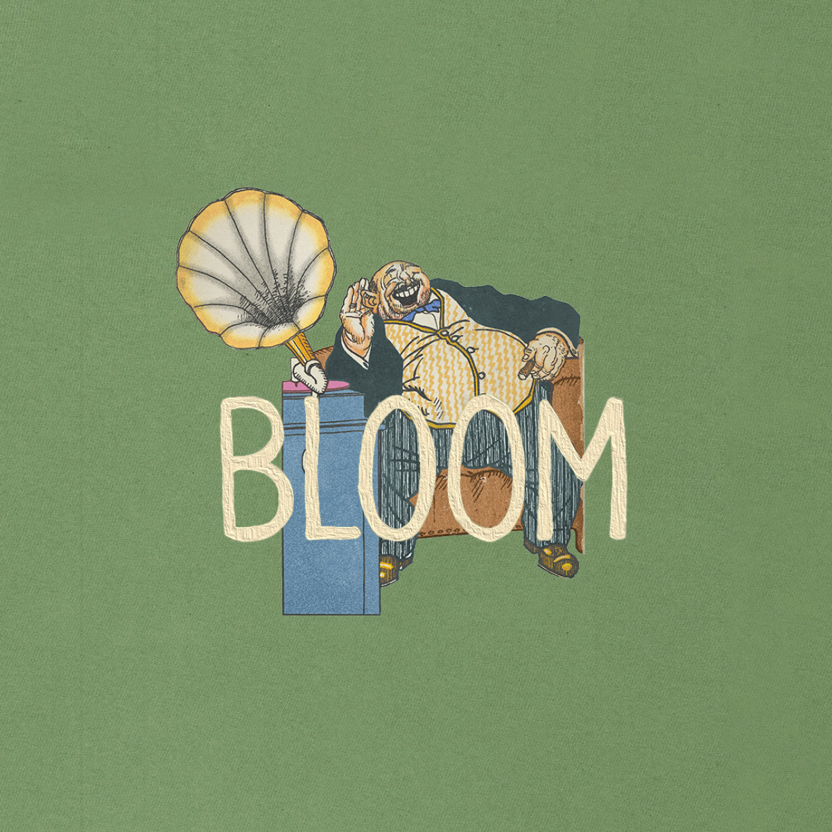
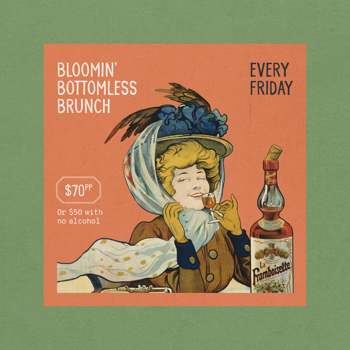
The branding plays on the concept of Wabi Sabi which is about appreciating and celebrating imperfection. The aesthetic is sometimes described as one of appreciating beauty that is "imperfect, impermanent, and incomplete" in nature.
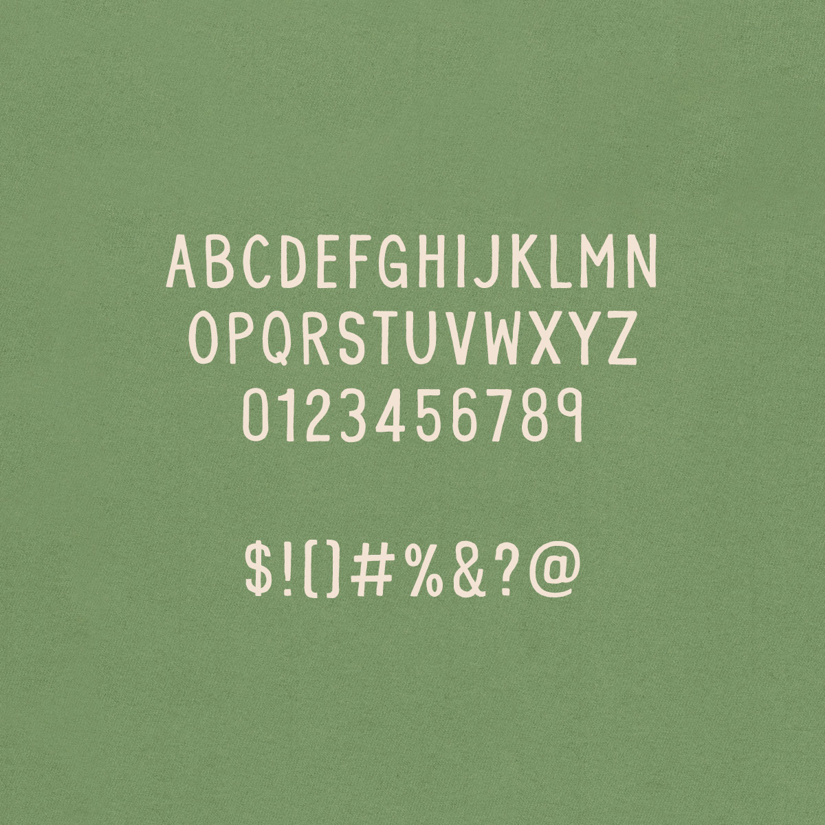
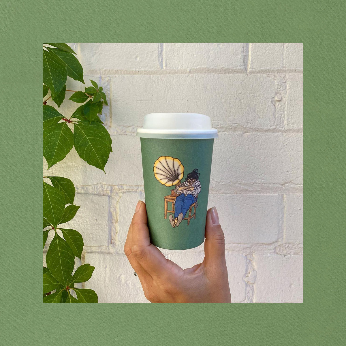
To achieve this outcome, the Bloom logo was hand-drawn, scanned in and vectorised to create a unique, personalised font style that is hard to find in digital typefaces. Unlike most other hand-drawn fonts that are usually too rough, this aimed to strike a perfect balance between organic and structured.
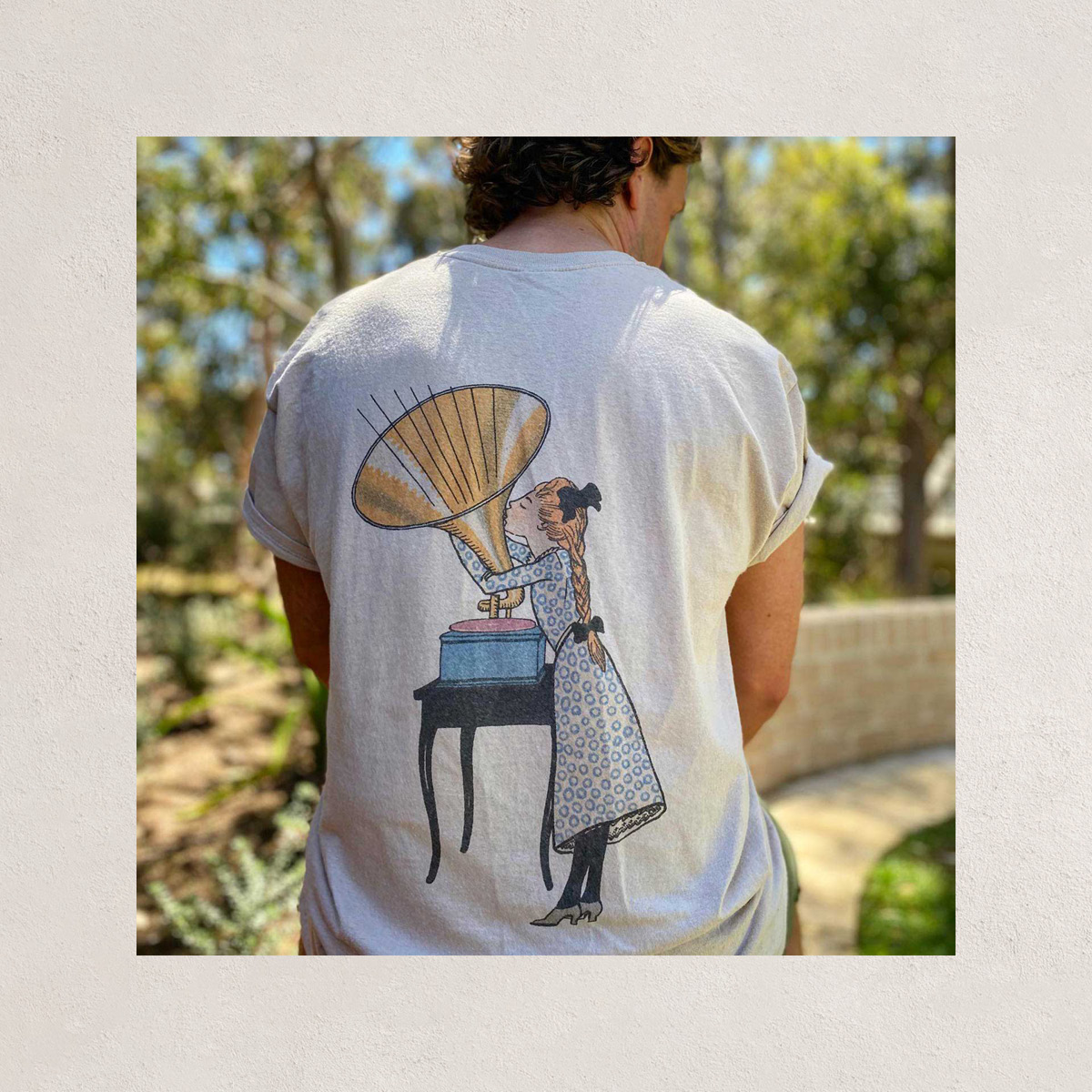
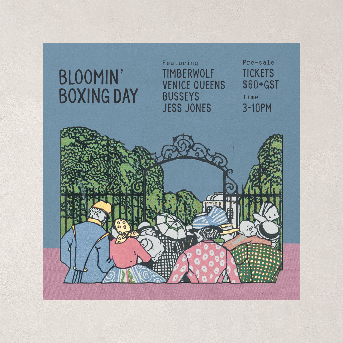
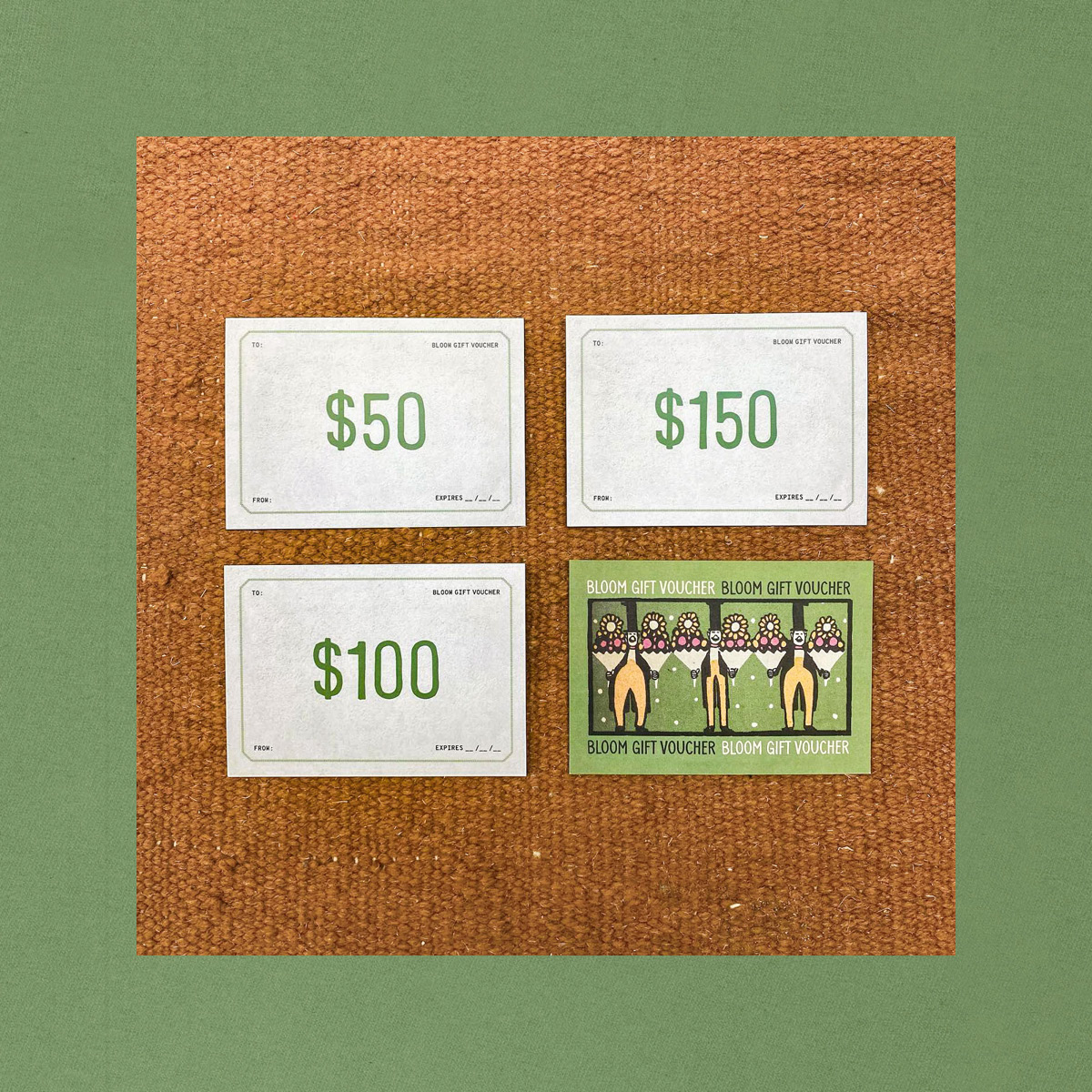
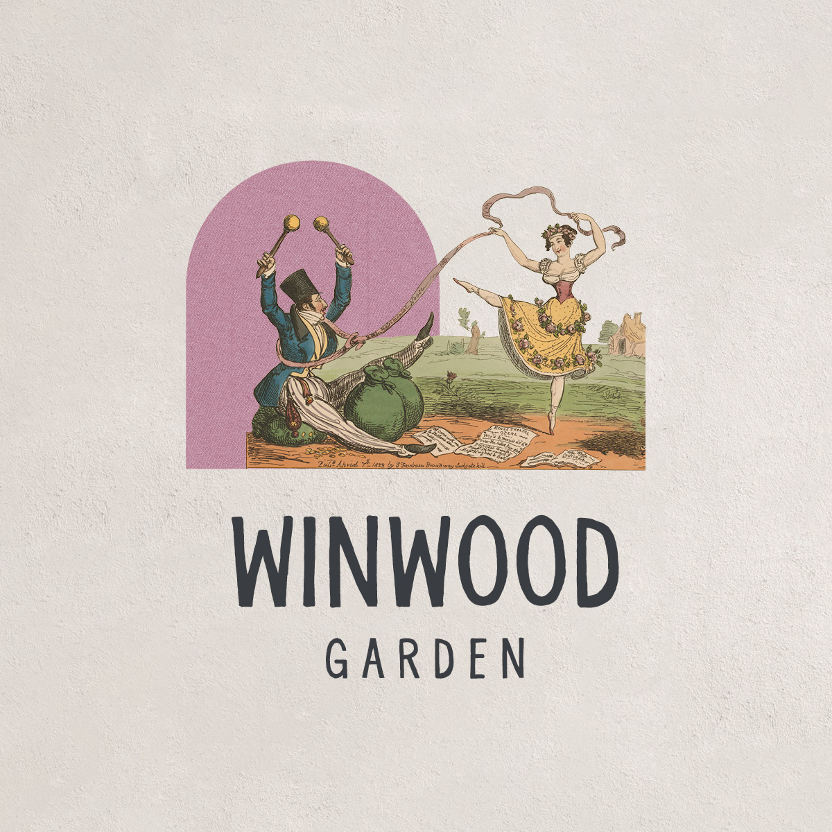
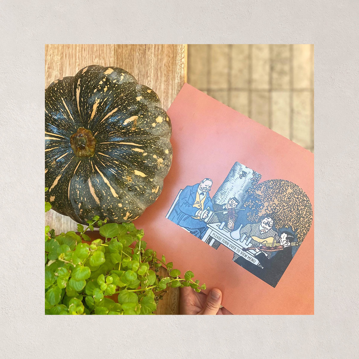
The brand formula then involves combining textured and earthy-coloured backgrounds with historical images by Moriz Jung, in cut-out, collage-art style. This was done to match the textured, stucco walls of Bloom's interior and further the idea of finding beauty in imperfection.


